It Doesn’t Fall Far From the Tree

“Be a yardstick of quality. Some people aren’t used to an environment where excellence is expected.”  –  Steven Paul Jobs

Steve Jobs’ announcement, that he was stepping down as Apple’s CEO, hit like a bag of bricks. Like most designers, my wife and I are members of The Cult of Mac, with an archive of elegant product design re-boxed and stored for posterity’s sake. There’s the pristine PowerMac Cube, Jonathan Ive’s opus of transparent minimalism (which holds a place of honor at The Museum of Modern Art). There’s the 20th Anniversary Mac, with its futuristic casework and Bose speakers. There are historic versions of software and books, all of which evoke nostalgia. But it wasn’t until Jobs’ unwelcomed news spread like wildfire across the internet, that I really took pause to consider the impact that his vision and relentless imagination have had upon my career.

The Art Center of today bears faint resemblance to the school I attended some twenty five years ago, its subterranean rooms now lined with dramatically down-lit computers, like a frame from the Blade Runner storyboard. Here, tomorrow’s illustrators and designers straddle multiple programs to create highly layered visuals, product and entertainment majors step into the realm of 3-D, and photographers offer up a better level of finish than reality has to offer. Except for a few amber screened, early model PCs that chugged out daisy wheel class schedules in the administrative office, the school I attended was analog. There were a handful of PCs for academic classes, and some rudimentary 3-D plotting was taught by a professor from Cal Tech.

Then it happened. Art Center cleaned out a supply closet, set up a folding table, and installed a solitary Macintosh. The humble machine, a gift from Apple, was made available to anyone interested in taking it for a test drive. Word got around. Nevertheless, it was hard to discern how this new and accessible medium bore any relevance to a world, where traditional drawing and painting were king. Sure, we were all in awe of Apple’s 1984 commercial. How could you not be? Just two years after the release of Blade Runner, Chiat Day tapped Ridley Scott to make a 60 second spot with a then unheard of budget of nearly a million dollars. The concept was timely and the styling seductive. I was also aware of the early adopter, digital pioneers like April Greiman and Barbara Nessim, and while I appreciated their work, the success of it seemed highly dependant on their ability to embrace the distinct limitations of the medium at that time.

In 1985, as I graduated from art school, Steve Jobs was ousted by CEO, John Scully and the Apple board of directors. Nine years after co-founding the personal computing phenomenon, the San Francisco born 30 year old began anew. That same year he launched NeXT, and although the new computer company failed to drive the hardware sales Jobs had anticipated, their software development contributed greatly to OSX, the web, and later generation Mac user interface.

The following year, Jobs purchased Pixar from George Lucas, and John Lasseter and his team released the studio’s first 3-D short: Luxo Jr. That same year, I took a position at the first all-Mac agency in Los Angeles. Apple had gained significant momentum within the design world, and developers such as Aldus and MacroMind were creating powerful software for this platform. This was starting to look like the future, and I wanted an education. My first machine was a Macintosh 512K, with 2 megs of RAM, and a whopping 40MB hard drive—very respectable at the time. There was contagious enthusiasm around the newness of designing this way, and much of what we were creating was sizeable and ambitious. The real challenge was in handling file size, as Apple’s diskettes held a mere 800k. Terry Oyama’s product design incorporated a handle in the top of the case, which made for easy removal from the packing box. For us, that handle became essential, as we would make a late night dash to the printer, the Apple itself becoming a giant floppy. We had the honor of working for numerous Fortune 500 Companies, including Apple itself.

In 1992, my wife and I launched The Fibonacci Design Group, a studio focused on concept and image driven creative for Entertainment and Silicon Valley companies. Work was fast becoming photo driven, and while Adobe Illustrator celebrated its fifth birthday, Photoshop was a mere two years old. There were no layers, and there was no history palette, meaning that you were committed to every move you made. Undoing a bad move could cost a day’s work. The IIcis we were running, took about 45 minutes to save out a double page ad, with another half hour or so to download onto Syquest. If we timed things right, we could squeeze in dinner as an image saved, finishing up just as a courier appeared at the door.

Steve Jobs returned to Apple in 1997. He remarked that Apple had lost its way, because it focused on commerce rather than imagination. “The cure for Apple is not cost cutting. The cure for Apple is to innovate its way out of its current predicament.” His software developments at NeXT were instrumental in his return to the Cupertino campus, where he now took the reigns as CEO, setting a new and ambitious course for the company. In November of the same year, the on-line Apple Store went live.

Since then, we’ve gone through a number of machines, enjoyed mind-bending  advances in the software we use. The Mac has enabled vast creativity in making and recording music, editing film, 3-D modeling, communicating across the globe—you name it, there’s an app for that. The types of innovation that once took years to transpire, seem to happen constantly. It’s hard to believe that the brick and mortar Apple Store is a mere 10 years old, and that in it’s wake we have already seen the development of the iPod, the iPhone, the iPad, and we are moving into the cloud. “It’s really hard to design products by focus groups. A lot of times, people don’t know what they want until you show it to them.” I can’t imagine what lies ahead, except that it will be elegant, relevant, and game changing.

The inextricable connection for me is that I’ve grown up with Apple, literally and figuratively. Many brands represent little more than commerce. On rare occasion, however, we experience one that truly resonates with us, both emotionally and culturally. Steve Jobs and Apple have innovated with enough future thought, that we have stretched ourselves creatively, and reimagined the world around us.

So, what wine would I pair with nostalgic recollections of Apple? Veuve Cliquot NV Brut, with its notes of lemony, smokey, Pippin apple and yeast, its creamy texture and freshness. It’s readily available (which should appeal to the egalitarian Mr. Jobs), and it’s an appropriate way to send up a toast. We have participated in an amazing new world, as seen through the eyes of Steve Jobs, and at his invitation, ourselves. For that, I am truly grateful. Cheers.

Under the Influence

With my favorite cowboy hat. 1955 RCA recording of Swan Lake.

I recently came across a few boxes I hadn’t opened in fifteen years or more. They contain the last vestiges of childhood memorabilia that I can’t quite let go of: my Tonka fire truck and car carrier, Creepy Crawlers kit with half filled bottles of Plastic Goop, a 1955 RCA recording of Swan Lake. I know—one of these things is not like the other ones. Truth be known, I own a few of copies of this album, having purchased them on eBay over the years.

As a kid, I would pull an armload of albums from the record cabinet and lay the covers out across the living room floor. I could spend hours staring at the pictures, the typography, and the wonderful color combinations. Small wonder that I worked at a record store in college, or that I went on to study graphic design. Yet, out of all the albums my parents owned, this one struck me like no other.

The cover is perfection: a ballerina lies on her back, shoulders pressed to the floor, her elegant legs pointing straight above. Her toe shoes, a pale blush color, land between the first and last name of Leopold Stokowski, and lead your eye to the title of the album. The entire composition floats atop the most sublime pea green background.

I recently learned that Andy Warhol designed the cover (his 15th) and the book that’s stitched inside, with fanciful pen and ink sleeve illustrations to which I was drawn, and the hand-masked photographs that suggest a body of work yet to come.

In retrospect it all makes sense—my affinity for the colors of Necco Wafers, my Father’s copy of East of the Sun and West of the Moon with Kay Nielsen’s exotic illustrations, Henry Vandyke Carter’s engravings from Gray’s Anatomy, Spirograph.

I asked some designers, illustrators and artists whose work I admire, what visually influenced them as children. Some answers were unexpected, some fitting—all were interesting.

*    *    *    *    *    *    *    *    *    *    *
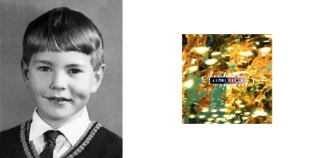
Vaughan Oliver. Album cover for Asobi Seksu.

“I’m a cheap date. Just give me a bit of type and an image to work with—I can find satisfaction in that.” VAUGHAN OLIVER’s name is synonymous with the evocative, often moody post-punk art of the 4AD label. For nearly 30 years, the British born designer has struck a tense balance between gritty texture, elegance, and a fine art sensibility, creating palpable atmospheres on which to place his highly stylized typography. His 23 Envelope and v23 Studio collaborations, with the likes of Nigel Grierson and Chris Bigg, have defined a genre through artwork created for artists such as The Cocteau Twins, This Mortal Coil, The Pixies, Lush, Robert Fripp, David Sylvian and Dead Can Dance. Vaughan has authored several books including This Rimy River and Visceral Pleasures, and his work has been included in the collection of The Victoria and Albert Museum.

Whereas all other responses were written, Vaughan sent the preceding nine images as his inspirations: 1) Instruction booklet for Ekco Radio, 2) Illustration plate from Ladybird Marco Polo, 3) Cigarette card of Apollo astronaut food, 4) Terrapin: Curious Member of the Tortoise Family, 5) Signed cigarette card of David McCallum in The Man From U.N.C.L.E., 6) Doilies, 7) Cigarette card of more Apollo astronaut food, including Salmon Salad, 8) Book plate titled Youngsters of Switzerland, 9) Radio tube value table.

*    *    *    *    *    *    *    *    *    *    *

Woody & Robert Pirtle, 1949. Poster for The Letter Y.

Texas born WOODY PIRTLE epitomizes concept driven, illustrative economy in design. The son of a corporate Penzoil pilot, he spent his formative years in Louisiana and entered the workforce schooled in fine art. By the late 1980’s, Woody’s work boasted numerous awards, he was voted into membership of the Alliance Graphique Internationale, and was invited to join Pentagram as a partner in their New York office. There he instilled his creative wit into identities, posters and corporate communications for clients ranging from Fine Line Cinema to The Rockefeller Foundation, from IBM to Pantone. In 2005, Woody re-established Pirtle design. He has served on the AIGA Board of Directors, has taught at The School of Visual Arts, has lectured extensively. His work graces the collections of MOMA, The Library of Congress and The Victoria and Albert Museum, just to name a few.

“I was mesmerized by the “test pattern” on our B&W television set as I waited impatiently for one of the few programs to be aired at 4pm in the afternoon – Howdy Doody. I was also intrigued with the odd bird on the Kiwi shoe polish tin, not to mention the brightly colored circles on the Wonder Bread packaging. And then there was my dad’s 1949 maroon Ford Coupe…”

*    *    *    *    *    *    *    *    *    *    *

Margo Chase’s logo for Buffy the Vampire Slayer.

“I got started by accident really. I was a biology major in college, studying to be a veterinarian.” In 1986, fresh out of grad school with a degree in Medical Illustration, MARGO CHASE set up shop. Her abilities in hand drawn typography, combined with a healthy dose of Gothic romanticism, landed her some highly visible design for the music industry. Warner Bros, Virgin, Capitol Records, sought Margo’s unique approach in developing logos and packaging for artists that included Prince, Madonna and Cher. These successes lead to title design for Bram Stoker’s Dracula, Buffy the Vampire Slayer, packaging for Kama Sutra products, as well as a line of celebrated font designs. These days, when she’s not engaged in competitive aerobatics, Margo marries her analytical aptitude with her right brain sensibilities, focusing on branding, positioning and problem solving for clients such as Target, Kemper Snowboards, Mattel and Cartoon Network.

“An important early influence was my mother’s calligraphy work, her books and all her unusual pens and nibs. She wrote beautiful letters and I used to watch her write out the programs for church in beautiful script. At some point I was given a set of lettering templates and engineering tools – compass, ruling pens and other mysterious objects – all fitted neatly into a wooden box. It must have been my father’s from engineering school. I had no idea how to use them. But I loved to take them out and play with them and them put them all back into their perfectly shaped slots. My grandfather’s hobby was photography. He had a darkroom in the garage where all kinds of strange-smelling operations happened in the dark. When we visited them in the summer he would sometimes let me in to watch. When I grew older he taught me to process film and make prints and enlargements. I loved watching the backwards/upside/down/negative images magically transform into scenes or portraits that I recognized. My family is full of creative people so the influences were all around me. It isn’t surprising I wound up a designer.”

*    *    *    *    *    *    *    *    *    *    *

Mark Hess. Prince Pasta Sauce: Regular & Chunky.

If you’ve ever looked at Time Magazine, leafed through the pages of Forbes, or placed postage on an envelope, you’re probably familiar with the work of MARK HESS. The Michigan raised illustrator, who rode rodeo bulls by the age of 10, began his career as a painter in 1975. By the age of 19, Mark landed his first of 17 cover illustrations for Time Magazine. Not to be outdone, Newsweek and Forbes followed suit, enlisting Mark’s witty references to culture past and present, all wrapped in an editorial twist. His postage stamps, including the Civil War and Legends of the West series, total 46 to date, and The Smithsonian currently boasts ownership of 41 of his pieces.

“As a child I had many visual influences that probably affected my taste and style. Some I can remember and some I’m sure are just part of my subconscious; rearing their ugly little heads when I least expect them, pushing me this way and that. I’ve actually been a bit of a child most of my life (or is that childish?), but I assume you mean a child as in before the age of 12 or so. So let me see what I can think of off hand…paint by number paintings, Rat Fink models by Big Daddy Roth, suburban Detroit, Bozo, match book Learn To Draw ads, race car graphics, Shari Lewis & Lamb ChopPlayboyTom TerrificGrandma MosesTopo GigioVargas pin-ups, record album art, murals in post offices, folk art, TV, Diego Rivera (a painting in the Detroit Art Museum), my incessant need to draw and represent the world around me (does “me” count?), barber polls, Robbie the Robot, funky drawings by other kids in grade school, bad clown paintings my grandmother liked (especially by Red Skelton), John Gnagy (TV art teacher), Highlights Magazine, sexy women, painted magazine ads (cars, cereal, Xmas, GE, candy, gas, tires, trains, boy scouts, fashion, SOS, Mr Clean, etc.), Saturday Evening PostMad MagazineTime Magazine covers (all paintings), Elsie BordenSoupy Sales, stiff, pointy bras, Creepy MagazineN.C. Wyeth illustrations, packaging (Toni the Tiger, Mr. Clean, Morton Salt, Quaker Oats, etc.), Godzilla movies, Life MagazineNorman Rockwell, Sci-Fi books. Ok, so some of these may not seem like visual influences (like Soupy Sales: he had crazy art on the walls), but I can explain every one. I think Picasso said, “Every child is an artist. The problem is how to remain an artist once he grows up. Easy, never grow up.”

*    *    *    *    *    *    *    *    *    *    *

Mick Haggerty. Album cover for David Bowie’s Let’s Dance.

MICK HAGGERTY moved from England to Los Angeles in 1973, became an accidental neighbor to artist Ed Ruscha, and launched headlong into a career designing iconic album covers ranging from David Bowie’s Let’s Dance and The Go-Go’s Vacation, to Supertramp’s Breakfast in America (with Mike Doud), and The Police’s Ghost in the Machine. Not surprisingly, the demand for his beautifully executed, high concept work led to Mick’s direction of videos for the likes of Public Image Ltd., King Crimson, Sting, The Violent Femmes, and The B-52’s. Today, Mick concentrates on his personal paintings and serigraphs, which are equally imbued with vaguely familiar cultural references, bold concept and graphic angularity. Shephard Fairey recently referenced Haggerty’s Jimi Hendrix poster and The Police’s Ghost in the Machine album cover as being two of his influences. Both are now framed and hanging in Shephard’s studio. (I had the pleasure of studying with Mick in 1985, when he served as a visiting professor at Art Center College of Design.)

“My bedroom wallpaper featured heavily in my dreams, bruise colored roses on pale blue as if imagined by Adolph Gottlieb…..The Beano’s Bash Street Kids …. Max and Dave Fleischers‘s Popeye… books of World War ll photographs, especially the explosions….the instructions in plastic model kits…and of course Bill and Ben the Flowerpot Men….”

*    *    *    *    *    *    *    *    *    *    *

Plilip Burke and identical twin brother Paul. Portrait of Tupac Shakur.

You know his work—the fauvist, caricatured, oil portraits that get the good real estate in Vogue, Rolling Stone, Vanity Fair, New Yorker. PHILIP BURKE, who grew up in a Buffalo, N.Y. Irish Catholic family with four sisters and six brothers (one of whom is his identical twin, Paul) employs his Buddhist sensibilities when painting celebrity musicians, politicians, actors, comedians. Burke’s use of distortion is intended to capture the essence, the intensity, the presence of a subject, and not to ridicule. The self-managed illustrator/artist averages eight to ten paintings a week, in which he draws from a broad array of influences that include Picasso, Francis Bacon and Ralph Steadman. His work is owned by many of the celebrities he has depicted, and he has been recognized by The Society of Illustrators, The Society of Publication Design, Communication Arts, and The Art Director’s Club.

Philip’s influences were, “Disney animation circa 60s—specifically the classic Mickey Mouse and Donald Duck—and the Saturday and Sunday funny papers!”

*    *    *    *    *    *    *    *    *    *    *

Archie Ferguson, 1979. Book Cover for Nick Hornsby’s About a Boy.

HarperCollins art director ARCHIE FERGUSON has a knack for the elegant solution—the one that communicates the maximum through his use of the minimum. He’s the guy who designs the covers that bring a smile to your face as you nod your head in the bookstore. “As a visual and analytical person, I don’t think I’ll ever stop seeking meaning or connection between things.” Archie graduated from the School of Visual Arts (where he studied with Paula Scher, and where he currently teaches) in the late 80’s, and began his career at Random House. Over the past couple of decades, he has designed between one and two thousand book jackets, has worked at Knopf (as a member of Carol Devine Carson’s dream team that also included Barbara de Wilde and Chip Kidd), Time Books, Pantheon and Schocken. His work has been featured in prestigious design annuals, and is the recipient of numerous awards.
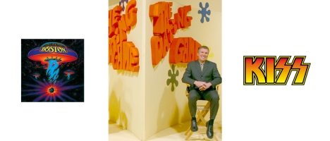
“Think the reason I liked Velveeta Cheese so much was because of the color. Had a penchant for the sets and fashion of The Dating Game, Rowan and Martin’s Laugh-In, and The Sonny & Cher Show. And of coarse The Brady Bunch. Kiss had really cool album covers and who could forget The Rolling Stones’ Sticky Fingers, and Paul Scher’s cover for Boston. My mom always dressed me in blue.”

*    *    *    *    *    *    *    *    *    *    *

J. Otto Seibold. Mr. Lunch Takes a Plane Ride.

J. OTTO SEIBOLD, illustrator of the upcoming Chronicle children’s book Other Goose, is probably best known for his characters Mr. Lunch and Olive (the Other Reindeer). The self-described “F+ student” worked initially as a Bay Area architectural designer. Then, in 1987, packing the full power of a three-year-old 128k Mac, J. Otto (pronounced like the famed Veronese architect and fresco painter) hung out his shingle as an editorial illustrator. Flying cross-country with his dog, Dexter Lunch, J. Otto brainstormed his first storyline and began his foray into the stylized, witty, whimsical (think Joan Miro and Hieronymus Bosch meet The Jetsons—with animals) world of children’s (and discerning adults) books. To date, he has created some 17 books, often collaborating with wife and writer Vivian Walsh. Olive the Other Reindeer was animated for television—Olive being played by Drew Barrymore—and garnered a Primetime Emmy nomination.

“Sure… I remember the creek. The bridge over the creek. A train that went across the sky. And the book Mike Muligan and His Steam Shovel….oh, and the roll-out of Hot Wheels.” J. Otto has also cited Lego Building Blocks and Speed Racer as being formative influences.

*    *    *    *    *    *    *    *    *    *    *
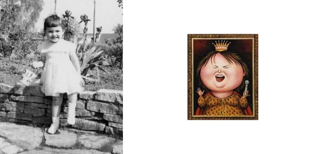
Anita Kunz. Illustration of Roseanne Barr.

ANITA KUNZ, Officer of the Order of Canada (think: Mick Jagger being knighted), and one of The Fifty Most Influential Women in Canada—as named by The National Post—turns gouache and watercolors into conceptual portraits and editorial illustrations, steeped in social and political context. The highly collected, prolifically honored artist has illustrated better than 50 book covers, and has contributed her visual perspective to GQ, The New Yorker, and Vanity Fair, not to mention Rolling Stone’s illustrated series of the History of Rock ‘n Roll. Having been powerfully affected by certain instructors during her education, Anita pays it forward whether lecturing at The Smithsonian, or teaching and leading workshops internationally.
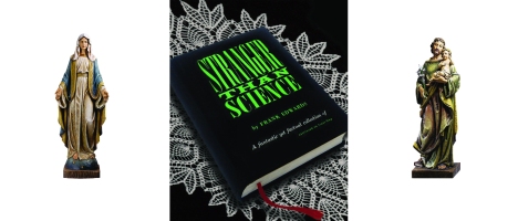
“Oh dear…I think I was kind of a spooky kid. I’d read books with names like Stranger than Science about spontaneous human combustion and stuff like that, and scare myself silly. And when we went to church (we did that back then) I’d watch the mouths of the statues and convince myself they were moving! Sheesh!!”

*    *    *    *    *    *    *    *    *    *    *

Barbara Nessim. “In Vision” from The Model Project.

BARBARA NESSIM put herself through Pratt, working as a fashion illustrator in the Garment Center. It’s no surprise, really—Barbara’s mother had been a clothing designer. Equipped with a degree in Fine Art and Illustration, she began what would be a pioneering career, at a time when few women worked as freelance commercial illustrators. Nevertheless, she parlayed her unique style into success, designing apparel and textiles. Then, in 1980, as many struggled to define what connection if any could be drawn between art and the advent of the computer, Barbara dove headlong into technology. Drawing upon her fine art mindset, she trailblazed a digital, visual vernacular that opened the doors of possibility, and continues to be a source of influence today. Barbara has served as an educator at the School of Visual Arts in New York, and at Parsons The New School for Design. Barbara has shown at The Louvre, is in the permanent collections of The Victoria and Albert Museum and The Smithsonian Institute, has graced the pages of Time Magazine and Rolling Stone.

“I loved black laced-up, low cut flat shoes, shoe store windows, black and white tile floors, dancing school costumes with all the sparkle, and Many Moons by James Thurber and illustrated by Louis Slobodkin.”

*    *    *    *    *    *    *    *    *    *    *

Clement Mok. The Republic of Tea identity.

CLEMENT MOK is a household name amongst the early-adopter Mac faithful. The Vancouver born designer, educator, author and entrepreneur spans the worlds of design, experience, and technology, and played an integral part in the birth of Apple’s brand. Mok understood that brand was more than a mark, and designed a comprehensive experience that has become a standard for the tech giant. In 1988 he launched Clement Mok designs, focusing on design for software startups. With the advent of the internet, he morphed CMd into the interactive-based Studio Archetype which he eventually combined with global consulting firm Sapient. Today, half of Sapient’s $600M revenues are due to Mok’s expansion of design into the concepts of brand strategy, user experience, information architecture, and usability. His clients have included Adobe, Apple, American Express, IBM, Nintendo and UPS. He has received numerous awards, has served as CEO and as an advisor on the boards of many tech companies and colleges.

“My earliest childhood memory about art and design were grade school art projects on making Mexican God’s eye, color wool yarns wrapped in concentric bands on a cross. It was a 60’s hippy thing. I was fascinated by how color bands of different hue, tone and width can effect the overall appeal of the finished piece. Instead of making one, I probably made a dozen of them — raiding and depleting my mom’s yarn basket. That was perhaps the catalyst in getting me started in design.”

*    *    *    *    *    *    *    *    *    *    *

Socially conscious designer CHERYL HELLER, was encouraged  in her love of cutting things with scissors—including the family’s maroon velvet couch. Pentagram partner MICHAEL BIERUT owes his love of design to Jon Gnagy’s television art lessons. Book designer CAROL CARSON loved listening to Peter and the Wolf, and would stare at the brightly flowered end papers of the book Walt Disney’s Surprise Package. BARBARA deWILDE, also a noted book designer, would copy art from Mad Magazine—whatever was funny.

So, step into Mr. Wizard‘s Way-Back Machine, and tell me—what inspired you?  In the meantime, I’ll decant a 2007 Domaine Solitude Chateauneuf du Pape. Talk about a shining example of the confluence of so many nuances and influences, this dark, perfumey Rhone boasts an herbal, beefy edge to the panoply of plum and cassis flavors and aromas.


Kind of Blue

“The essence of great art is that its power is inexplicable, and in the jazz stratos there’s never been anything like this 1959 session. It reigns to this day as the genre’s greatest hit and the most coherent album length statement in modern jazz history … Modern jazz starts here.”  –  iTunes Reviewer

Miles Davis, Kind of Blue Sessions, 1959. Don Hunstein © Sony BMG Entertainment

March 2, 1959, Miles Davis pushed through the doors on East 30th Street in New York, walked down the hall to the recording studio, and forever changed the sound of jazz. Although he was riding high on his success with such releases as “Birth of the Cool”, “Round About Midnight” and “Porgy & Bess”, he eased his grip on hard bop jazz and sought a fresh perspective. Through his use of modality, Miles Davis thinned out the density inherent in the jazz of the late 1950’s, and he crafted instead a sense of openness, melody and reflection.

Modality greatly expanded the possibilities for improvisation—something critical for a sextet that would enter the studio unrehearsed and without charts. As was his custom, Davis had merely suggested to the musicians, scales on which they might riff. To his benefit, the 32 year old trumpet legend was surrounded by the best and the brightest. Paul Chambers on bass and Jimmy Cobb on drums, provided the rhythm section. In a stroke of brilliance, Davis employed two pianists: Bill Evans and Wynton Kelly. Where Kelly brought a strength in blues to the session, Bill Evans set a contemplative tone like no other. Likewise, Davis juxtaposed the funky sax riffs of Cannonball Adderley, with the spiritual musings of John Coltrane, all of which maximized the dimension of the music.

John Coltrane, Cannonball Adderly, Miles Davis, Bill Evans. Kind of Blue Sessions, 1959.

Columbia’s 30th Street Studios, a converted Armenian Greek Orthodox Church in Manhattan, would witness the recording of such landmark albums as Bob Dylan’s “Highway 61 Revisited” and Glenn Gould’s take on Bach’s “Goldberg Variations”. The ceiling, over a hundred feet high, gave the sound a particular ambience and clarity, a quality that producers Teo Macero and Irving Townshend would exploit in shaping the acoustical space of Miles Davis’ magnum opus. Macero, a fellow alum from Julliard, had produced “­Porgy & Bess” and “Milestones” and would continue to produce Davis into the early 80’s.

Recorded in a mere two days, “Kind of Blue” would become the best selling—and arguably the most influential—jazz album of all time. On March 2, 1959, “So What”, “Freddie Freeloader”, and “Blue in Green” were laid to tape, comprising Side One. On April 22, “Flamenco Sketches” and “All Blues” were tracked, thus completing the album. “Flamenco Sketches”, the lyrical ballad that began Side Two, appeared on the album as a complete and unaltered first take. During the same month that Miles Davis and his sextet recorded their second session, they opened a two week engagement at Birdland, on 44th Street. Taking a break between sets, Davis was beaten and arrested for loitering in front of the jazz club.

In August of 1959, “Kind of Blue” was released. In November of the same year, Atlantic Records released Ornette Coleman’s “The Shape of Jazz to Come”. Coleman’s freshman recording of avant-garde free jazz, hailed from the other side of the universe, with it’s frenetic, collective improvisation and its atonality. It was every bit as revolutionary as the experimentation with modality, and as such, it stole much of the thunder that was due Miles Davis.

This past year, “Kind of Blue” celebrated its 50th anniversary. It ranks number 12 out of Rolling Stone’s 500 Greatest Albums of All-Time, has been recognized by Congress as a national treasure, and was inducted by the Library of Congress into the National Registry. Vibraphonist Gary Burton would remark, that unlike many forays into uncharted territory, “Kind of Blue” was a breakthrough in its entirety. From the first lyrical bass intro on “So What” to the last, lilting chord of “Flamenco Sketches”, there was absolute dedication. Fluid, weightless, and filled with possibility, “Kind of Blue” is the documentation of a perfect moment in time.

*    *    *    *    *    *    *    *    *    *    *

On a recent trip to Lou Wine Bar, my wife, “The Buddha Buddy” and I took our server’s suggestion and tried the 2007 Ogu Cannonou from Panevino. This dark, Sardinian red is the perfect accompaniment to “Kind of Blue”, with its unexpected notes of coconut meat and salted butter, it’s open structure, and its juicy, pensive low tones.  This wine is not easy to track down, but is well worth the effort. You can call the importer, Louis Dressner, to find a merchant in your area.

Design at 33-1/3 RPM

“I like to mess with reality…to bend reality. Some of my works beg the question of is it real or not?” – Storm Thorgerson

In the Fall of 1979, fresh out of High School, I landed a job at at the local record store. Licorice Pizza—named for an Abbot & Costello gag—was hiring Christmas help, and what started as seasonal employment grew into a five year stretch. The store was intoxicating, with the smell of glossy album sleeve printing, shrink wrap, and of course the beautiful vinyl of an era gone by. Out in the bins that wound their way through the store, lay an unexplored galaxy of every music imaginable, housed by beautiful designs that stoked the imagination.

Our assistant manager had a famed room, one that I was to visit just once. Spared of any furniture, the walls were lined with albums—thousands of albums, speaking all manner of musical language. Translating on their behalf, was the coveted Luxman turntable, with a bamboo needle that conveyed true warmth with the sound.  I slid into the headphones, and floated away on endless waves of Brian Eno’s Music for Airports. I’m not sure how much time elapsed. It might have been hours; it could have been days. Nevertheless, it was an epiphany that would forever amplify my love of music.

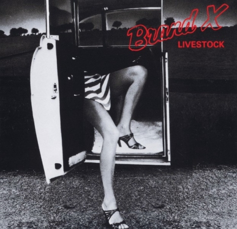
Brand X’s 1977 release ‘Livestock’ was the first album that I bought unheard. I was taken by its cover, which depicted a limousine door suspended in space, out along a rural road. Two shapely legs protruded from the door, which opened up to a car that did not exist. The image was so spare and witty; the double entendre so clever, that I had to know what was inside. I was not disappointed. Looking for a fresh challenge, Phil Collins had partnered with a group of British jazz musicians, and the product was incendiary. The cover art had depicted so very well, music that was clever, conceptual, and well—different. Before long, I realized that much of the cool design work was coming from across the pond.

Hipgnosis took form in 1968, when British art students Storm Thorgerson and Aubrey Powell were approached by Pink Floyd to design the cover for ‘A Saucerful of Secrets’. Having studied film and photography, both knew their way around a darkroom, and their ensuing style would exploit that knowledge to the fullest, creating images that defied reality. Initially, the two gained access to the darkroom at The Royal College of Art. By 1970, Thorgerson and Powell opened their own studio, and would design such iconic covers such as Pink Floyd’s ‘Dark Side of the Moon’ and Led Zeppelin’s ‘Houses of the Holy’. Their name, like their design, reflected a penchant for double meaning, with Hipgnosis being a homonym cobbled together from the words Hip and Gnosis (Gnosticism).

In 1974, Thorgerson and Powell  were joined by designer and photographer Peter Christopherson, (founding member of Throbbing Gristle). In 1982, some 14 years after its inception, Hipgnosis closed its doors with nearly 200 albums to their credit. Their art had graced the covers of such artists as T. Rex, Peter Gabriel, ELO, AC/DC, Yes, XTC, Emerson, Lake & Palmer, Todd Rundgren and many, many more. Their work would influence the development and functionality of Photoshop, and would pave the way for the surreal, treated and layered imagery with which we are so familiar today. Ask any designer what first turned them onto design. Chances are, they will get a wistful look in their eye, recalling countless hours spent laying on the bedroom floor, lost in the intersecting worlds of music and design.

*    *    *    *    *    *    *    *    *    *    *

So the question remains, what pairs well with Hipgnosis? Clearly, something layered, complex and clever. Ladies and gentlemen, I give you the beautiful, the talented, the multi-faceted 2006 Turley Pesenti Vineyard Zinfandel. This Paso Robles based winery makes some of the very best Zinfandel California has to offer. Year in and year out, it’s their Pesenti Vineyard designation that really sings to me. This wine is dense and extracted, with waves and waves of juicy raspberry, cherry, blackberry, spice, pepper, cedar and balsam. The nose is enormous, the color opaque, and the finish sails on and on.

Flipping the Bird

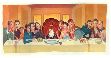
Tim BarnesThe Last Supper, 2003

I love Thanksgiving—time spent with friends and family, remembering what it is that we’re thankful for. But truth be told, it’s the condiments and side salads that pique my palate. The bird I can take or leave. Engineered like a Malibu Barbie®, the modern day turkey is all breast, no brain, and dare I say lacking in taste? While many assert that Nirvana is to be found through brining, basting, barbequing, broiling, and even deep fat frying, they all seem like so many variations on an insipid theme.

Last year however, as we prepared to host dinner for twenty, my wife happened upon a Martha Stewart recipe that changed our Thanksgivings forever. We ordered our turkey from the local butcher and had the breast, legs and wings removed intact. Once home, we opened the breast on the counter like a book and then butterflied it again on either side so that there were now four panels. With gentle pounding, it became flat and even, about ¾” thick and two feet wide. We then coated the top with sausage and pecan stuffing, rolled the breast like a cinnamon roll, rewrapped it in the skin and covered it with cheesecloth. We trussed the whole affair with string, and voila—it was ready for the oven. The legs and wings, meanwhile, braised in the slow cooker with white wine, chicken broth, and herbs. Sound difficult? It’s not. And because the white and dark meat cook independently of one another, the breast stays moist and the dark meat falls off the bone.

The upside? Flavor, flavor, flavor. This log of savory goodness is easy to prepare and only requires an hour of cooking time (the braised dark meat cooks for about 6 hours). If you dislike carving and its requisite refresher course in anatomy, you’ll appreciate the ease in serving this turkey and the beauty of its presentation.  And for that, I give thanks.

*    *    *    *    *    *    *    *    *    *    *

If you’re willing to rethink your holiday fare, then may I suggest a new accompaniment? Like Pinot Noir and Champagne, sommeliers know that Dry Riesling is a go-to wine for a host of comestibles. Its fruit and acidity enable it to stand up equally to tart cranberry sauce, earthy bird and creamy gravy. On a recent business trip, Sloane and I stopped at Trefethen—one of the few Napa Valley wineries to produce Dry Riesling. That’s due in part to their Carneros location, which tends to be cooler.  The 2008 Trefethen Oak Knoll District Dry Riesling should be served just below room temperature. Any colder, and you run the risk of muting the aromatics and flavors of this mouth watering white. It is very pale and elegant in color, with a beautiful nose of lime, stone fruit and jasmine. The palate has a zippy core of acidity running through the intense lemon, lime and mineral notes. The finish is long and rounds out nicely at the end. Unlike many whites, Riesling will age for years, oftentimes evolving in flavor. Zeke Neeley—winemaker at Trefethen—notes that the optimal age for a Riesling is subjective. He feels his wine hits its peak about five years after bottling, in which time it will develop iconic petrol aromas. His wife however, prefers the wine young and crisp. Either way, it’s a fantastic pairing with turkey.

A Constellation to Call My Own

“My wines are like a person. They talk, they change, they tell you something different every sip. They taste different from one day to the next, from one hour to the next. That kind of complexity is what makes wine interesting.”

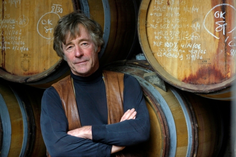
Sean_Thackrey

Michael J. Walsh, copyright 2006

In 1970’s, San Francisco gallery owner Sean Thackrey left behind his career as a dealer of Nineteenth Century French photography and began making wine. His education did not come from UC Davis, nor from any traditional studies of oenology. Instead, Thackrey began to collect ancient and Medieval texts on the subject, opting for an approach that would yield wine that differed greatly from what was abundantly available.

In 1979 Thackrey bottled his first wine, a Bordelais blend of Cabernet and Merlot sourced from Napa Valley’s Fay Vineyard. While this first attempt was of sufficient quality to reaffirm his change in vocation, he nevertheless would shift direction, making the observation that Napa Valley style wines did not fascinate him. “They’re just too damn polite for me. Why drink a wine that you wouldn’t like if it were a person? It’s like sitting next to someone and everything they say has to be so proper.”

Thackrey turned to Mourvédre and Petit Sirah—two grapes which at that time, did not have the status and popularity they now enjoy. Both were generally used in blending cuvées, and were rarely bottled as stand alones. And while the American wine landscape became enamored of terroir —the sense of place imparted by a specific location—Thackrey dismissed its importance, favoring an alchemist’s approach. Pleiades, which comprises about 60% of his annual 5,000 case production, is based on a shifting blend of grapes such as Carignane, Barbera, Mourvedre, Syrah, Sangiovese, and Viognier. These are strange bedfellows to be sure, but then this perfumey gem tastes nothing like anything I’ve had before or since.

At the age of  67, Sean Thackrey produces five wines, all named for constellations. His fascination with the patterns we impose onto nature, draws an interesting parallel to the intellectual curiosity he exercises when blending grapes and making bits of heaven. Sean Thackrey is a Renaissance man—he speaks seven languages, is an expert on and a collector of 19th Century photography, is a photographer himself. Today he maintains one of the World’s largest collections of ancient and Medieval texts on the subject of wine—the very same manuscripts from which he learned his craft.

*    *    *    *    *    *    *    *    *    *    *

I managed to get my hands on a couple bottles each of the 2006 Sean Thackrey Sirius Petite Sirah and the 2003 Sean Thackrey Aquila Sangiovese Eaglepoint Ranch Mendocino. Because the Petite Sirah is expected to cellar for 20-30 years (take that, first growth Bordeaux), I opted to open the Sangiovese. This red is stunning and full of the surreal and heady attributes that I enjoy in the Pleiades, but with additional complexity, depth and savoriness that make this far more food-friendly and sophisticated. This deep scarlet wine immediately offers a perfumey nose of eucalyptus, chocolate and malt. The body is glassy and Pinot-like, but with an extra viscosity that the glycerin note lends.  Raspberry, eucalyptus, cocoa, tart cherry and a hint of smoke continually trade off on the palate.  The structure is seamless and perfectly integrates fruit, tannins and acidity into a supple experience with a long, long finish. This is most unusual—I am absolutely blown away.

Let’s Go Dutch

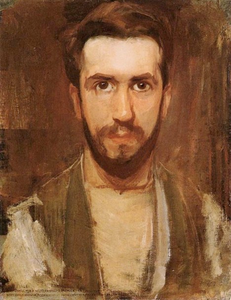
Piet_Mondrian_Self_Portrait

Piet Mondrian, Self Portrait, c.1900

Joel Bass, fine artist, builder and and instructor at Art Center College of Design, gave an assignment that lasted the better part of a semester: take a sheet of black cover stock, trim out a series of ¼” wide strips, and create a grid of 5-7 rectilinear shapes, such that no one intersection or space becomes more important than another. It sounds like a simple proposition, but this is difficult to achieve.

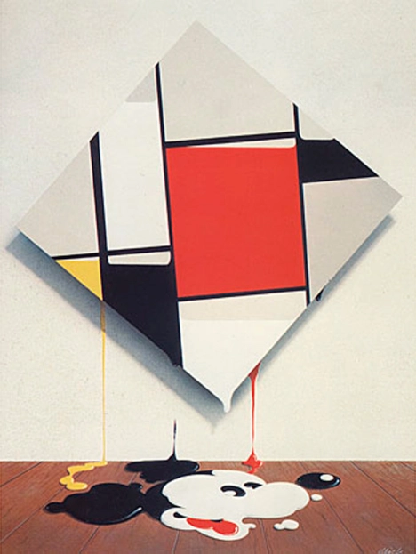
We’re all familiar with Piet Mondrian’s iconic paintings based on a similar premise. His linear compositions have become a part of American culture, whether as the modular wall on Ray and Charles Eames’ Case Study House No. 8, or the expression of Pop Culture painted by Mick Haggerty in Mickey Mondrian.

Mickey-Mondrian

Mick Haggerty, Mickey Mondrian, 1976

Mondrian, Dutch, was born into a Calvanist society in the late 19th Century. His uncle was a commercial painter; his father an amateur. His early work reflected the tradition inherent in his surroundings. But when Mondrian was introduced to meditation and Theosophy in 1909, he began to pare down and clarify his point of view.

Theosophy held that horizontals represented femininity and worldliness. Vertical lines were the symbol of masculinity and spirituality. Mondrian’s traditional landscapes gave way to stylized trees with strong vertical and horizontal themes. Eventually the trees would disappear, allowing Mondrian to focus solely on the balance of vertical, horizontal, space and tone. The well considered balance, the honesty of intent, the sum total of Mondrian’s experience would create compositions of enduring resonance.

Composition-II

Piet Mondrian, Composition II in Red, Blue, and Yellow, 1930

*     *     *     *     *

Wine, like art, takes many forms. There is much enjoyment in the exploration of highly detailed aromas and flavors. But there is also pleasure to be had in wine that is crafted with fewer elements, where balance and proportion cannot hide behind a veil of complexity. The 2007 Franck Millet Sancerre, Insolite falls into the second category. This Sauvignon Blanc from the Loire Valley is a pale greenish gold, with a nose of Pippin apple, lemons and lime zest. An initial hit of Meyer lemon and lime folds in on the mid-palate, yielding a fantastic note of sea salt and a long, mouth-watering finish. As the wine opens up, a hint of slate enters the mix. My wife Sloane and I like to pair this with The Barefoot Contessa’s Chicken Picatta (an extremely easy recipe). The experience is sublime.

Form Follows Function

Mies-van-der-Rohe

Crown Hall, Mies van der Rohe

“Form follows function.”  So proclaimed Louis Sullivan, in a phrase that would become the trend-changing mantra of modern design. What does this mean? For architects such as Le Corbusier, Walter Gropius and Mies van der Rohe, it meant the celebration of functional integrity at its purest, and a dismissal of ornamentation for ornamentation’s sake.  For the industrial designers of the 20th century, it meant economy of form, and an honesty in the use of materials. Artists such as Marcel Duchamp and Andy Warhol would come to express an appreciation of the everyday object at it’s best. And music? Groundbreakers such as Steve Reich and Philip Glass would redirect the listener’s experience through the use of gradual change, and a focus on smaller phrases that were often repeated. While these ideas were shocking in their infancy, they have shaped our culture as we experience it today. Simply put, that which is not essential becomes a distraction.

So how does this translate to wine? Many wineries now produce wine for immediate consumption, mass appeal, a “wow factor”. Overly oaked, they contain high levels of alcohol and sugar that overwhelm the tongue, leaving little to the imagination.

Does this become ornamentation for ornamentation’s sake? That depends. If your intent is to enjoy wine that imparts a sense of “place” and becomes a harmonious participant in the course of a meal, then these New World “fruit-bombs” are likely to be the bull in a china shop. But when vintners draw upon integrity of form and honesty in their use of materials, wine takes a truly functional (and beautiful) form.

*     *     *     *     *

Husband and wife winemakers Mike and Tina Cox, marry form and function in their 2005 Mayro-Murdick Pinot Noir, Carneros. This stellar wine combines the structure of a French Burgundy with the fruit of a California Pinot, making for a versatile red that is equally successful as a stand alone aperitif or as the accompaniment to a wide range of dishes. Crystal clear and garnet in coloration, this wine has a generous nose of mulled cherry and rose petal, with the faintest whiff of barnyard. The palate of juicy cherry and strawberry rhubarb pie picks up a hint of orange zest on the nice, long finish. The frame is super supple, with great balance and seamless tannins. This just keeps getting better.

A Map of the Universe

'The Path', Dan McCaw

The Path, Dan McCaw

For many years, Irish-born painter Dan McCaw taught figure painting at Art Center. His technique was based on mixing together every color on the palette, making a neutral that would then be added to each color as it was applied. What that meant, was that an overarching harmony was built into each painting, since every color now had something in common with every other color that was used.

The Fibonacci Series is much like that neutral from McCaw’s paintings, in that it describes the harmony between ourselves and everything we see and know. The Fibonacci Series is the anatomy, the DNA, the underlying architecture, the infinite map of the Universe. It describes the twist in the long bones of our bodies, giving them greater strength. It describes the nautilus form that water takes when going down a drain. It is the number series that shows the growth of populations, or the increasing numbers of seeds in each successive ring of a sunflower. While the Fibonacci Series is named for Leonardo Fibonacci, a 16th Century mathematician, its appreciation informed the design of the Parthenon some 2,000 years prior. The Fibonacci Series is present in the proportions of classical Greek urns, the crescendo in Mozart’s Requiem; it is the point at which the hands of God and Adam meet on the vault of the Sistine Chapel.

Seventeen years ago, Sloane and I considered names for our nascent business. We were surrounded by design that was purely ornamental, but sought work that built upon the lessons of Art History, Architecture and the Life Sciences. Hence, the name Fibonacci. For us, design without structure, without concept, without meaning, has a short lifespan and a deficit of value. Design that connects is timeless.

*     *     *     *     *

While you relax and consider the structure of the infinite, enjoy a glass of the 2007 Fabre Montmayour Malbec Gran Reserva. This Argentine red is dark and rich, with the super polished, glassy structure of a top drawer zinfandel. Its nose of blackberry and cookie, lead into a palate of blackberry, blueberry, sweet coffee, maple and dried rose petal. The finish lasts a good long time, and the 14.5% alcohol seems right in line with what this balanced, food friendly wine has to offer.